This is the first post in a series I'm calling: Making an app: from conception to store. Here I present the concept of our example app; you may recognise the format from my 'Preparing to make an app' post which prompted this exploration. I hope that the series fosters understanding from a broader audience and promotes more digital ideas in the marketplace.
The concept
An app which allows the user to store independent counters for occurrences in their lives. Suppose you want to keep count of how many meals you eat per day, or how many pens you've lost, or just how often you actually visit the gym. Our app will ensure the storage of said counters. Secondary features include data grouping and presentation for insights. We want the user to be able to interact with the data they have stored by presenting statistical charts for historical significance.
Research
There are other apps which explore our primary concept, some more popular than others and most of them are free. It can be discouraging to see that our concept is already out there, but it's worth noting that even after seeing the competitors' we aren't immediately using their apps. That generally means that at least one aspect of the app we envision is better than what's available.
The medium
The counters exist only on the users’ device without login, which is enough to make this a native app. But the competitive edge of our app is that we will use custom animations; a relatively unique user interface; and data analysis capabilities. The market Our research shows us that the competitors’ apps don't look great. Many of the designs look to be from the pre-iOS7 era [recall that Apple introduced the new "flat and translucent" design at that time], and some of them look like they could even be submission-test cases. Few have ways to interact with the data so our analysis tools are novel for the space.
The counter apps on the store are all fundamentally lacking: they present at most ten counters to select from on a single view. The apps count more than ten things, but they need multiple presses or repeated swipe selection to get beyond the primary counters.
Visualising the concept
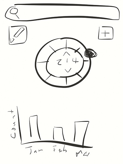
Figure 1. The home view
home view doodle
Figure 1 shows our proposed interface: a search bar [potentially hidden]; the edit and add buttons; the counter selector/viewer custom object; and some form of visual analysis tool. Interacting with the selector is via the black button: with a press-and-drag-to-position action. The intention is that the button will hug the contour of the circle and anchor to center of selector-items that it passes, like that of a click-wheel motion.
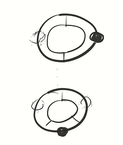
Figure 2. The selector growing
moving from 2 to 3 counters
Notice how the separation always produces equal selection-items, see the change from two counter-items to three above. The usage of a circle lets us get beyond the ten item limitation that the other apps have. Our view can present twenty items comfortably and upwards of thirty for advanced users.
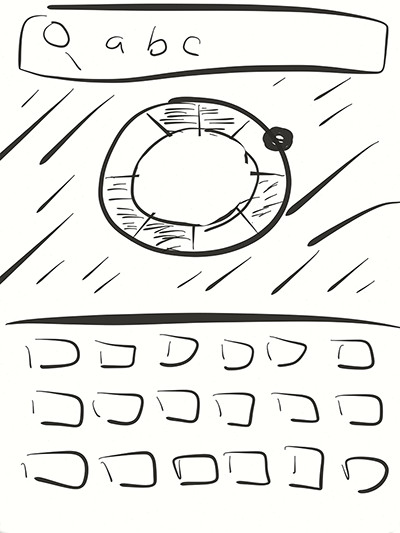
Figure 3. Searching
masking some counters during search
Here we visualise searching and its interaction with the selector. Notice how the search view has adapted to only show the search field and the items in the selector that meet the search criteria.
Figure 4. Create/edit Basic create/edit view: it takes in the name of the counter (for searching); a base count (lets us start higher than zero); and an increment amount (defaults to one).
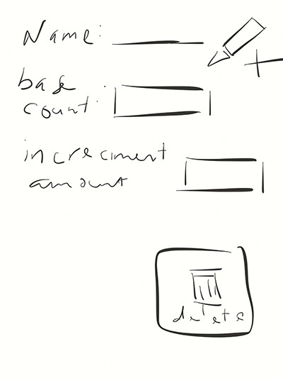
counter creation view
What's missing?
There's no close-up of the data analysis sub-view because we haven't thought beyond presenting changes over time [in monthly blocks]. And that's OK because we can add features in a later release so long as we store more information than a single running tally. We may, for instance, want to store the date-time associated with each increment. Keeping track of times as well as counts gives us more options when presenting the information. We definitely could have presented more information and gone into greater detail for the Research and Market sections.
What's next?
The concept presented in this post is clear enough for us to proceed with development or design as it conveys our app's interaction and overall direction.
