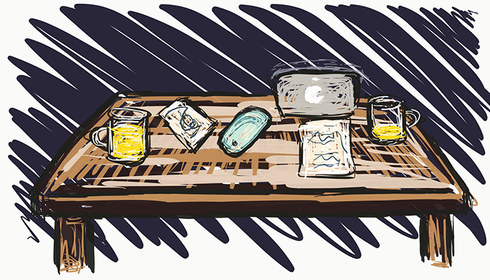
This post wasn't part of my initial plan for the Making an app: from conception to store series but some of the discussions we had while working on the counter app belonged here. When our apps' designer (David Delvallé) and I had concepts in front of us we had an open dialogue. Our ideas resulted in more potential directions for our app. This piece describes the topics we covered and presents professionally designed concepts for Spinner+ (credit to David for the branding).
Figure 1. Base branding concept in both light and dark

The most recent posts in our series can be found in our Development and Design posts respectively. Or you can start with our Concept post and follow the entire series to this point.
Social sharing
One of Spinner+'s competitive advantages is that it shows (limited) statistical information. David proposed that the user be able to share a branded image of the graph which appears below the selector. Sharing is a great idea because it allows the user to spread their excitement about the data in a way which promotes the app. However, it might need extra development: integrating a networking package which was not already in place. The outcome of the suggestion was to leave it with me while I considered alternatives. iOS has integration with services like Facebook and Twitter so we can make API calls which interact through the devices connections rather than [importing a networking package and] creating our own.
The counter name position
The original concept had the counter name in the middle of the selector face. This meant that if the user was to move the selector the name would be obscured by some part of their hand.
Figure 2. The obscured title and progression to a solution

David rectified this immediately by adding a visual restriction (seen in the second sub-image). He toyed with the concept of having the currently selected counter appear in the navigation bar (third sub-image). But ultimately we introduced an animation that triggers when the indicator is pressed. The animation shades out the rest of the app showing only the counter name and selector face (the final sub-image). The name updates during the drag action and the screen returns to normal when their finger is released.
Increment amount too high
As suggested in an earlier post, David and I, involved others in our concepts process. One of our.. focus group?.. proposed an interesting question (rephrased for clarity): what if the user wants to increment by less than the set increment amount for their counter? He used an example of Pressups which counts up in sets of 20, his standard rep amount, but asked what happens if he only gets to 19 that day. We explained that you press on edit, then change the increment to 19, then save the update, and finally return to the counter screen and press 'add.' As we described it we recognised it was horrible UX.
Figure 3. Slider doodle

We eventually introduced a new interaction for our app: the press-and-hold action. The new approach states: if a counter has an increment value greater-than 1 then the user has two ways to add to the counter using the add button. Tapping on the button normally adds as normal. So in the pressup case the counter increases by 20. But if the user presses and holds the add button, the UI will change: the entire app will darken and a new UI object would appear near the users thumb: a slider. The slider would start at some mid-way point between 1 and the max increment amount. The user - maintaining their current 'add press' - can now scroll upwards or downwards to change the increment amount. So in the pressup case it would start at, say 7, and allow the user to scroll up til they saw 19. Releasing their press increments the counter by the amount indicated by the slider.
Social pulling
Earlier we mentioned sharing outwards form the app to social media. David also proposed a second entirely new concept: what if we counted the users social media data?
Figure 4. Davids social pulling concept

The idea is pretty cool: the user creates a new counter just as they normally would; but rather than entering details they click on a social-link button. This then presents them with a bunch of social media to integrate with. Lets say they select Twitter, and they specify "count tweets"; after logging into Twitter via the app we would pull and process the data. We don't need to request data beyond the starting month of counter-creation. We can then maintain the data every time the user presses sync (and even allow the user to automate the sync process).
This means that our app would now have both an interactive and a passive experience. Passive interaction (i.e. the user doesn't have to do anything) immediately increases our potential user base.
Analytics and user tracking
Among the ideas described above, we also added to the brand: private user data and a sense of trust. We were interested in how the users use the app to aid in our future direction. So we proposed using some form of tracking - say Google analytics - to tell us what users were naming their counters; or how often they incremented items; or switched counters; etc. This data is invaluable to us from a marketing perspective but we agreed that the nature of the data and the way the app has been portrayed is personal. So we would have to have a way for the user to turn it off. [Or better yet ask them if they want to opt in].
Monetisation
It's no secret that apps make money. And we have considered how Spinner+ could bring in revenue. But our focus this early is to build a really solid free platform and worry about integrating add-ons after. We might, for instance, allow all users to pull from twitter for free but charge $0.99 to unlock Facebook tracking. And there's still a lot of potential for themes. We intend to release with both the light and dark interface options as depicted in the design images above but there are more concepts than that.
Figure 5. Theme concepts
