Post three in my Making an app: from conception to store series. Here we present the development approach for the counting-app described in our Planning and Specifications piece.
Please note that every app is unique and your build process should take this into account.
Don't reinvent the wheel
A lot of UI elements are part of the UIKit provided by Apple. For many that aren't, you can find custom implementations online. Twitter's pull-to-refresh mechanic, for instance, is here under an MIT licence. This functionality grew so popular that Apple added in iOS7 as UIRefreshControl (which has customisations of its own now).
All our controls are provided by Apple except for two elements. The Bar Chart Presenter and the Counter Selector are bespoke. We found a nice framework that presents charts but there was nothing exactly like the Counter Selector available. There were a few projects to draw inspiration from though.
- Bar Chart Presentor
- Jawbone/JBChartView
- Counter Selector (Inspiration)
- eliotfowler/EFCircularSlider
- RGelata/RGCircularSlider
- appzzman/JMCircularColorPicker
Jawbone's ChartView is near perfect. It's extremely well constructed and the active commits from the community make me trust that it's stable. The plan is to use the framework as-is and acknowledge the author as required by the licence. We will have to build the Counter Selector from scratch but there are some functions that we can adapt to meet our needs. If you look closely at the prototype you might be able to see which elements I took from each project.
Rapid prototype
For apps with complex user interaction I suggest building a prototype containing as many of the UI elements as possible. Prototyping will let you get a feel for the placement and ensure the feasibility of the layout. This build doesn't need to have any actual data associations, in fact: it's better if it doesn't interact with real data. Remember the goal is to get the UI placed and to get a feel for the development involved.
Animation 1. The prototype (embedded Vimeo [no audio], 4mb)
The prototype uses red circles to show anchor points and blue overlays to visualise inaccessibility on the wheel. The Bar Chart and the counter labels don't react to wheel selection because that would require data associations.
If the app had external interactions e.g. connecting to a server; we would have built in basic connectivity to ensure that the communication is feasible.
Show your stakeholders and justify quirks
At this point we have committed about 15% of our overall development time. That means that changes and suggestions this early aren't crippling for our timeline. Get some outside feedback.
This step also helps us recognise which features of the UI need 'polish.' Polishing UI might better expressed as falling down a time-sink. Despite taking as much as 20% of our development time, polished features often go unnoticed by the user. But that's the outcome we want. If we avoided the additional development the final result would irk the user and alter the fluidity of their experience.
Animation 2. Direct anchoring bug (embedded Vimeo [no audio], 938kb)
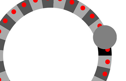
For our build the polish has to do entirely with the Counter Selector's indicator. The indicator anchors itself to the center of the counter-piece closest to it when released. But the anchoring motion causes the indicator to ignore the circular pathing it's usually bound to. Correcting the animation proves time consuming to correct in our prototype.
Figure 3. The obscured counter selection

Another polish feature is something which becomes apparent when we add a lot of counters. Our indicator isn't precise enough to show you which item you are on when the counter sliver is smaller than the indicator. We propose adding a pointer coming off it which will rotate, depending where on the circle the indicator lands, such that it always points towards the center. The rotation is fiddley, thus time-consuming, to implement.
Rebuild everything
Now that we have finished prototyping we can build the data-structures, and then rebuild the UI elements. In our prototype we didn't focus on efficiency or maintenance but in the rebuild it's the primary goal. I find this is far easier in a clean rebuild especially because you avoid a lot of "working" code while you try things out.
For instance: the prototype's Counter Selector is made up of three distinct sub-views all layered on top of one another; with shared objects managed by the presenting ViewController (this is terrible implementation, but it's quick). In the rebuild we reduce the sub-view count to two: one which focuses on drawing the counter-pieces; and the other which handles touch gestures. We also wrap the pair of sub-views together with any Counter Selector objects to make one 'large' object. Allowing us to interact with the selector from the outside and respond to delegate triggers following best practise.
Here we also consider optimal data-structures to ensure smooth animations and efficient battery use. We noticed when implementing the Bar Chart is that it makes two passes of its data set --the first to determine the maximum bar height (to scale the others appropriately), and the second to actually draw bars. Recall that our bars will be made of grouped 'counter interaction' objects (each of which represents an increment by the user). So we want our data-structures to present totals and other metrics with few passes.
Bring in your assets and test
Importing assets generally requires collaboration with your designer to ensure partial-transparencies layer correctly and that your elements align well. This is also a good time to apply any drop shadows and make sure your fonts look good.
All that's left now is testing. Test your app. Distribute it to your friends and have them test it too. For some of them: don't tell them what the app does and observe how they interact with it. It's a fantastic way to see how intuitive your functionality is. If you find people aren't interacting with the app the way you want then adding an instructional overlay is really effective for its development effort (see Item 3 here). This overlay is just a view with some well placed text (or images) that draw the users attention to tools while providing instruction. Remember, a patch can help you recover from a bad launch, but you should still strive for the perfect build.
