The second post in my Making an app: from conception to store series. Here we explore the digital planning for the clarified concept from our previous post. I note that everyone has their own processes and details which they focus on. This planning approach allows for the professional design and development to occur concurrently.
Branding and Direction
We haven't come up with a name yet, so building the brand is difficult. We simply present some keywords and themes for our app to aid direction. Utility-- like a calculator, calendar, or clock; we want our app considered a core application. Clean-- maybe better described as minimalist; we want obvious focal points and intuitive use. Easy-- again: intuitive use with as few touches as possible. Timeless-- I thought of "professional" here as an alternate term, but it's not that I want it limited; I just want to ensure that users don't tire of the base design. Friendly-- this is to balance out some of the other keywords. We don't want our app to feel intimidating. Our target audience is open; so we want a base colour scheme and the overall design to feel inclusive.
Wireframes
Our goal for wireframes is to convey which elements belong on which view.
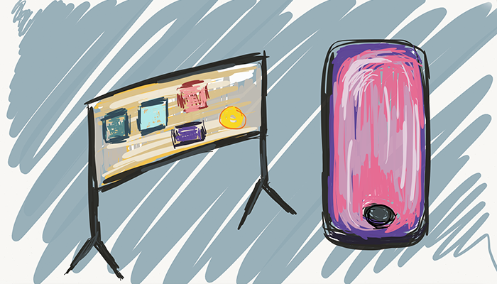
Figure 1.

We formalised the doodles from the concept post. After laying it all out within the screen's dimensions I tested a view where only the counter-selector appears and the extra items present off of triggers.
Figures 2 and 3.


The user experience feels better on the second approach because it presents just like the concept: a primary function and secondary functions off the main.
From a technical stand-point presenting the secondary features on sub-views takes minimal effort; so we leave our designer with both options.
Figure 4.

The search view is the same regardless of our main view's UX direction.
Figures 5 and 6.


We reuse the Create and Edit views by hiding the trashcan and changing the text on the Save button to 'Create' as required. We also present a disclaimer when the user tries to update an existing count.
Functional requirements
Here we have options: we can aim to be clear with a set of direct statements or we could even come up with user-stories if we want to go agile. For this series, I present a mix which is closer to the former.
- User
- - the users' preferences and counts are maintained directly on their device (one user per app installation).
- - the most recently selected counter persists between launches.
- System
- - Counters treated as objects which contain a counter name, base count and increment amount.
- - Counter names are unique, but counter objects maintain a UID so that users can rename counters without altering data-structures.
- - Counter objects also contain a set of 'counter interaction' objects which store the date-time as well as its increment or decrement status. Consider keeping a running tally rather than iterating over the set every time. [Note: keep object open, this may later include location items.]
- - Counter objects can be created, incremented, decremented, removed, and reset in real-time; they are dynamic.
- Custom Selector
- - a circular selector with equal-size selectable items around the outside.
- - redraws when counter-items are added or removed.
- - an indicator, which hugs the outer circle, can be moved to select the nearest selectable item.
- Data Presentation
- - the title of each selector is always visible above the selector -- this is dynamic and updates as the user drags the indicator.
- - once an item is selected on the selector the center of the selector presents the current count and basic interaction options (increment and decrement). Pressing either updates the data structures and view accordingly.
- - a view which presents a simple bar chart is below the selector. Build modally as this view may auto-hide.
- Tools
- - there are two buttons: Create and Edit; Create presents a new view which allows for the construction of a new counter object. Edit presents the same view with minor alterations and preloaded data which allows for name edits, increment adjustments, reset, and deletion (see Figures 5 and 6).
- - Search: interacting with search alters the main view to hide secondary elements and fits the selector within the viewable area with keyboard (see Figure 4).
- - Search: searching for items makes potential matches appear differently from regular items on the selector.
Future considerations
It's often helpful to think about add-on's so that both the developer and the designer can prepare accordingly. For our app there are only three future considerations at this stage. The first is themes; the second is location tracking for increments, and the third is additional data presentation options (other than the bar chart). Now we are ready to proceed with professional design and development.