This post is part of my Improvement Directions series and explores adding native (full screen) iPad support to your iPhone app. And context describing the decision-making process employed for Spinner+'s iPad extension. See alternate improvement directions in my previous post.
Why make your iPhone app universal?
Before we start, it's worth noting that all iPhone apps will run at iPhone-4 screen-sizes for the iPad (portrait only). You can even magnify it to 2x so it fills most of the screen. Using Apple's analytics tools you can check how many iPad users have your app installed before you decide on the extension.
As a general rule: if more than 25% of your user-base is working on iPad its worth giving them some attention.
iPad support will also draw in new users who filter their app store search results to iPad only.
Figure 1. Spinner+ platform statistics
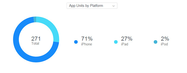
In addition to audience appeal, presenting on the iPad gives you more screen real-estate and allows you to consider longer user experience cases. Where your iPhone user tends to be "on the go" an iPad user tends to be relaxed and have more time to interact with the information on the screen. You can even showcase imagery or charts in a way that would be overwhelming on the iPhone screen.
How much effort does it take?
Depending on functionality changes between devices it is relatively painless. Apple's native implementations employ MVC architecture. Basically, this means that all your functions and your views are separated but linked. Including the iPad view can be achieved by constructing new iPad layouts and linking it to your original iPhone function-set (making the iPhone views and iPad views siblings). You can deal with iPad specific cases in your codebase with standard OOP approaches.
Note: if you used storyboards you can even update your layout constraints instead of creating specific iPad views (assuming you wanted all elements on the screen to hold the same relative positioning).
Figure 2. MVC visualised
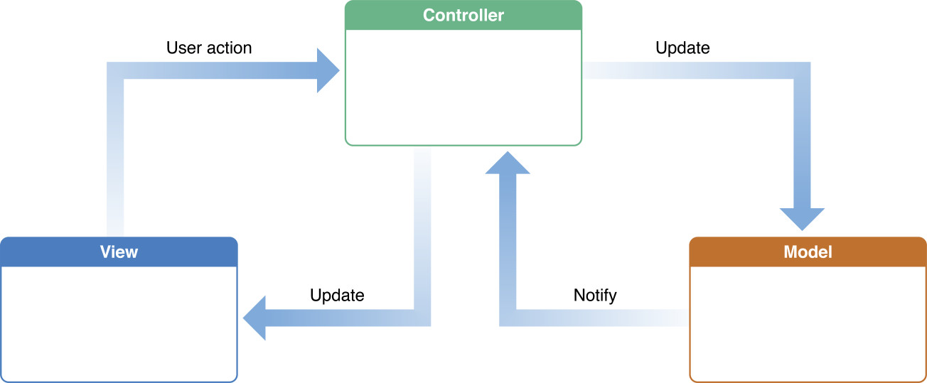
For Spinner+ we introduced a protocol to all visible views requiring that they "updateForCurrentFrame." This rule requires all presenting views to do what the method name suggests and adjust all its contents to realign for its frame. The change allowed iPad presentations and rotations to come about quickly since all elements are scaled/skewed to whatever frame the iPad ViewController wants them to be.
Tip: Introduce a translation paradigm
Your app was designed for iPhone; and while its wise to redesign for the iPad, financial or time constraints make it difficult. A way around this is to ensure that the iPad view re-presents iPhone views in a consistent manner. As with all layout decisions the final say should be left with your design lead, but having a base layout means that your apps functionality doesn't have to change between platforms.
Figure 3. Spinner+'s iPhone home screen broken down into its main sub-views
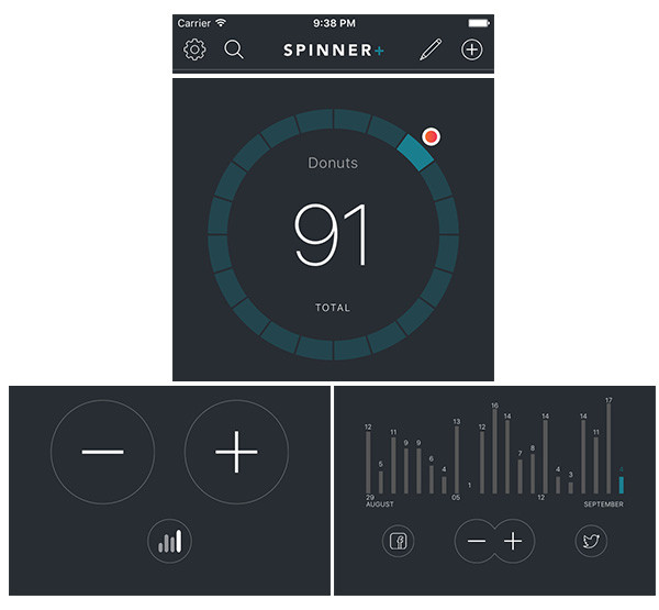
Figure 4. Spinner+'s iPad home screen broken down into its main subviews (portrait)
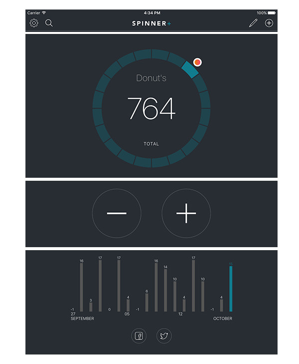
Here we decided that it was better to present more information without the switcher (and keep the subviews smaller). This begins the creation of our paradigm: if there is more space we will show you more.
Figure 5. Spinner+'s iPad home screen broken down into its main subviews (landscape)
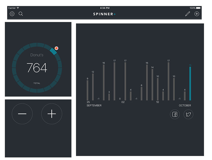
Notice that we went with a iOS-split-view-like approach which is immediately familiar to any iPad user. This also allows us to consider one of the subviews as a "feature" and present it accordingly.
Moving forward in the series you will be able to see adherence to this basic paradigm for new views.
More for the 'Wider Audience' direction
This direction is far from complete. We can still make "little steps" where we increase iPad functionality further, allowing for multi-app support. Or even grow to include another platform: Apple watch. And then we still have custom language support to explore.
But this is a strong first iteration for this direction.
