The second post in my improvement series in which we consider the addition of new features and how to charge for them. Our series will continue to follow the development of Spinner+ and ultimately frame the discussion on this single app.
Assess what you already have
It's important to take stock of what your app already has and how you can enhance your software with those items. This both reduces development/design time and ensures your app has a consistent user experience. For Spinner+ we already have themes; counter objects; the interaction objects that we use to produce graphs; and the graphs themselves. You will see these elements used within the new features.
Advertising
Spinner+ didn't lend itself to integrated advertising so banners were our only real option. Integrated advertising refers to ads that look like regular elements in the application. Facebook and Twitter integrate advertising with Sponsored Posts and Promoted Tweets, for instance. We toyed with the idea of making every seventh counter an "ad-counter" but the user would skip over them. If we presented an ad-view as they changed counters instead, it would defeat the purpose of the application as a quick-tally utility. Note: we haven't given up on presenting ads on the main face, it's just that we want to do it right.
Paid add-on example - Counter types
Counter types came up during the focus testing pre-release but were too far from the app's core premise for the release version. Now that we have established the main purpose of the app we can branch out.
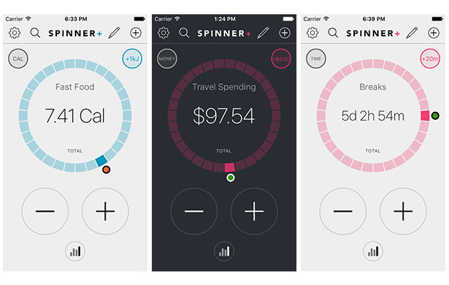
Figure 1. The counters on the selector face.

- Calorie Converter. A food energy counter which stores and increments in kilojoules but presents the total in calories.
- Money. A counter which stores and increments with decimal numbers, then presents the total in a localised currency format.
- Time. A counter which stores and adds minutes then displays the total parsed into days/hours/minutes.
Spinner+ is (currently) twice as popular in the US region than it is in any other zone. One of my suspicions as to why has to do with food packaging regulations. In the US, nutritional information on food is stated in calories. Almost everywhere else in the world food energy is required in kilojoules. This means the original Spinner+ app is a calorie counter in the US, but no where else. The calorie converter add-on is our attempt to even out the region usage for the new Spinner+ version (while profiting). The other counter types are just common tracking metrics.
Custom counter types make for great add-ons because they only need 'presentation updates' (as apposed to a drastic system overhaul or a new view). We considered selling counter types as a bundled set but decided that users would prefer to pick and choose which counters they have access to. Those in the US would never need the calorie converter, for instance.
Free feature - Achievable themes
Our base system already has themes so adding a new one costs ten minutes development with a few minutes testing. So we introduced some new functionality: locked themes which unlock based on user interaction. Unsure of the ideal numbers for the cut-offs we opted to offer 2 achievements around social sharing. We didn't want to encourage, say 20 counters, if the average user tends to hold around 6.
We played with the idea of animated themes suitable for a paid model. But the amount of work required to implement them just doesn't seem worth it for the conversion rate.
[The conversion rate for in-app purchase is low (for Spinner+ I'd be happy with 1.0%).]
Free with advertising - Increment history viewer
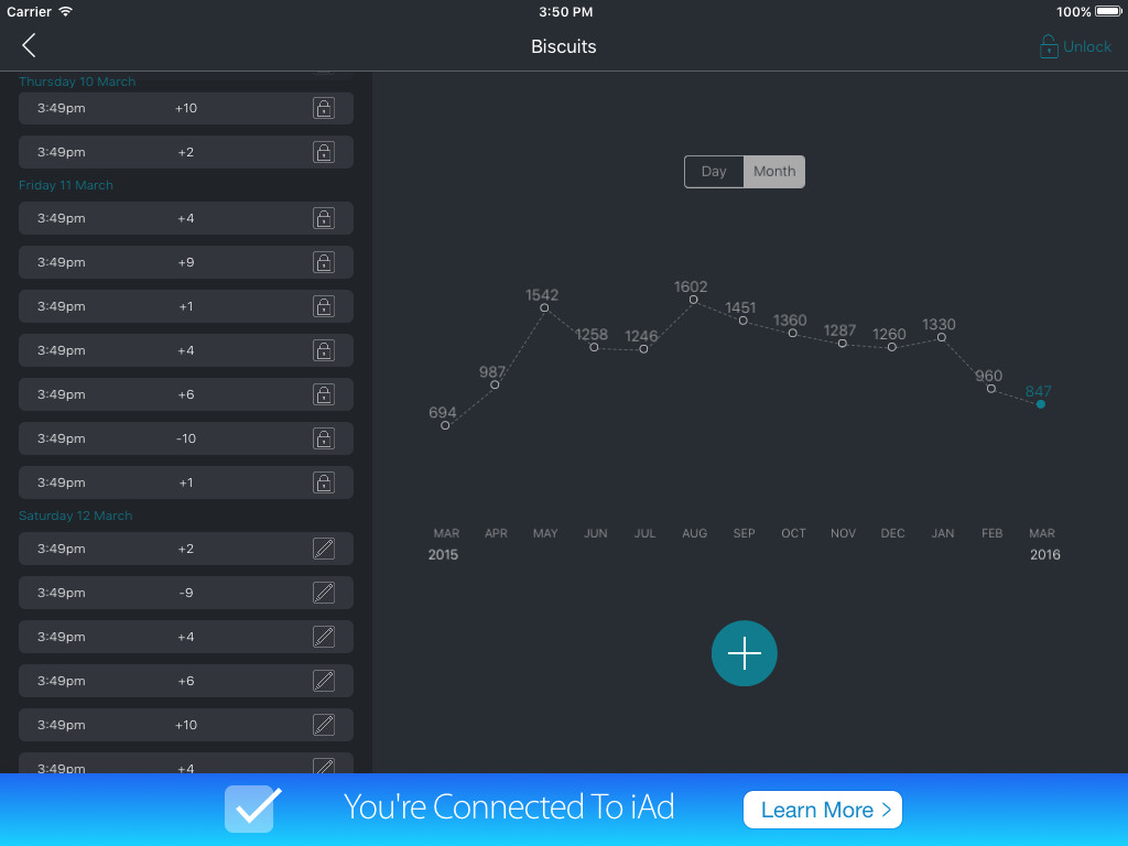
Spinner+ is able to graph and regroup its data because it stores its own history-items of changes. We wanted to showcase our unique approach and allow the user to tweak the data set. Along with editing features, it also lets us present the entire month and whole year at a glance.
Figure 2. Statistics+ on iPad.

We added the banner on this view for a couple of reasons. The first was due to the development time for Statistics+ (approximately 20% of the original apps development time). The second is because the user is likely to spend longer than thirty seconds looking at the view (so we can see more than one ad per session). To encourage ongoing visits to the page, we limited the editing features to the past four days. Our user retention data shows that the regular user has no more than three days between launches. Users can unlock the increment viewer for a fee, which removes the advertising and also allows edits beyond the four day restriction.
Pricing
The cost of add-ons can be tricky, especially for a free app. I find that trying to price for the add-on alone makes me undervalue it. What I do instead is ask myself what a fair price would be for the base app assuming the considered add-on was part of its premise. So for instance: how much would you charge for a calorie converter that shows you your food energy intake over time and across multiple sources?
We then priced the other add-ons relative to the first custom counter. We can always adjust the pricing later if its off.
What's next?
This is our first new-feature-iteration, and we have only scratched the surface. The original data structures have accommodated for location tracking and a "cost per unit," both of which still aren't used. For now we will continue improving the app in other directions. I feel a design injection is order: our in-app purchase confirmation view is too plain, for instance.
